As an Amazon Associate, we earn from qualifying purchases. Some links on this site are affiliate links at no extra cost to you. Our recommendations are based on thorough research and editorial judgment.
How Light Color Affects Kitchen Material Appearance
Light color greatly affects the appearance of kitchen materials, particularly cabinet colors. Warm light (2700K-3000K) enhances yellows and browns, while cooler tones (above 5000K) can mute them. Natural daylight showcases whites crisply, but can warm them in the evening. It is crucial to test color samples in various lighting conditions to guarantee ideal harmony. Consider the room’s orientation and finish sheen, as both impact reflected light. Explore further to discover additional insights and practical tips.
Key Takeaways
- Warm light enhances warm cabinet colors like yellows and browns, making them appear richer and more vibrant.
- Cooler light (above 5000K) can mute warmer colors, diminishing their vibrancy and appeal in kitchen materials.
- Natural light varies throughout the day, affecting how white and gray cabinets appear, leading to shifts in color temperature.
- The sheen of cabinet finishes influences how light reflects off surfaces, altering the perception of color in the kitchen.
- Proper lighting placement, including ambient and task lighting, can significantly enhance or distort the appearance of kitchen materials.
The Role of Natural Light in Perceiving Cabinet Colors
You may be interested
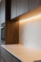
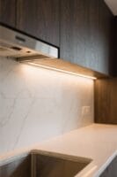
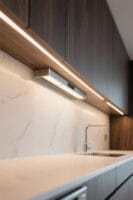
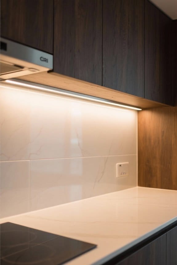
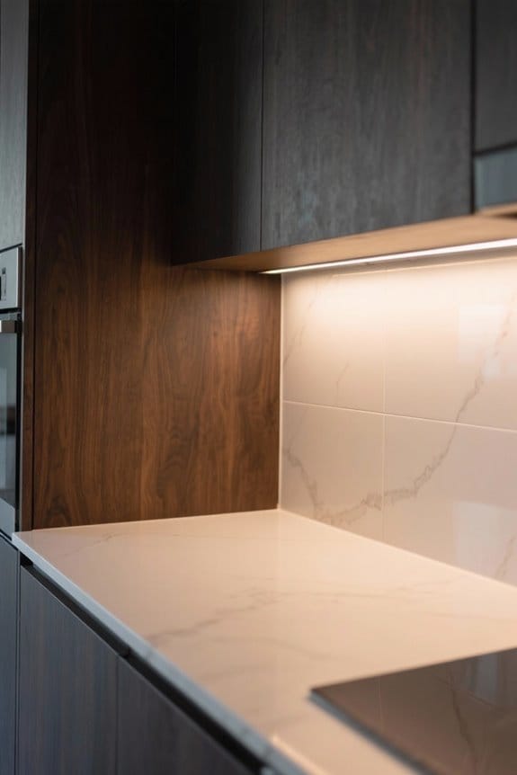
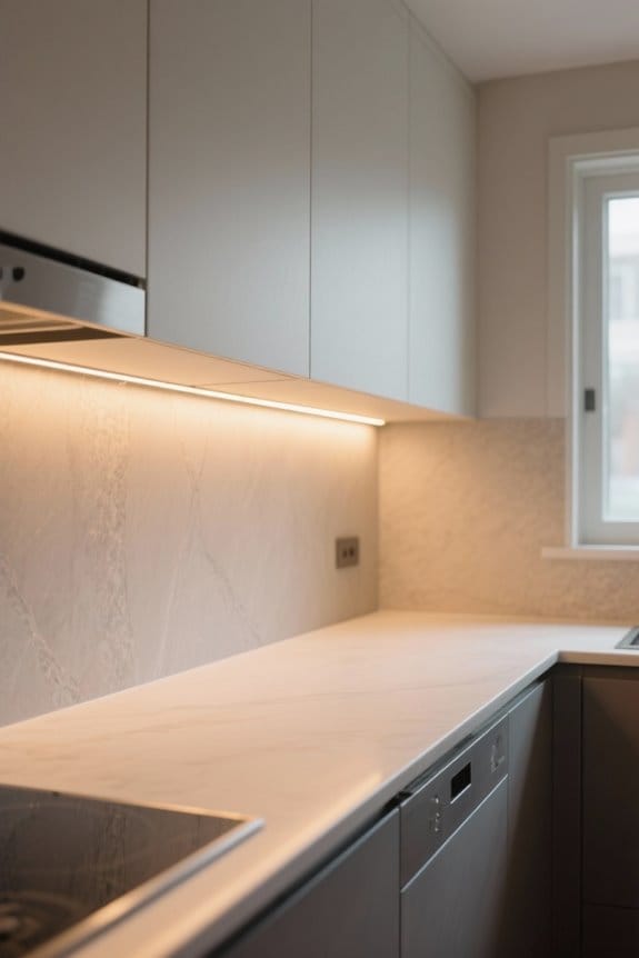
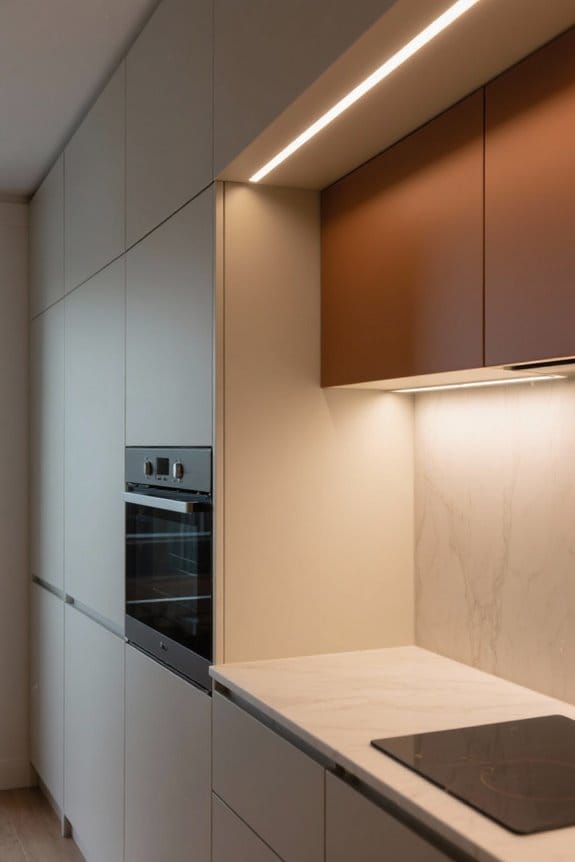
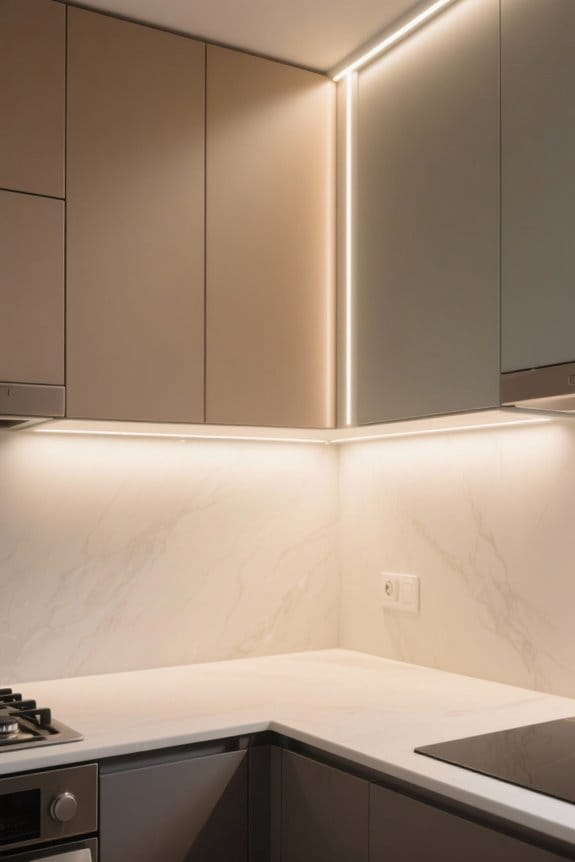
Natural light plays an essential role in how kitchen cabinet colors are perceived throughout the day. Morning daylight often casts warm tones, enhancing colors and allowing subtle undertones to emerge. In contrast, midday light is brighter and more neutral, affecting the color perception of darker cabinets, which may appear muted. Overcast conditions diminish brightness, causing cabinet colors to look less vibrant. Be mindful of window orientation; south-facing windows provide the best natural light, while north-facing orientations tend to introduce cooler tones. For maximum reflection and brightness, utilize minimal window treatments and consider mirror placements. Monitor how different times of day affect your kitchen’s ambiance, ensuring your desired cabinet colors truly shine. Installing LED under cabinet lights with adjustable color temperatures between 2700K and 5000K can help maintain consistent color appearance regardless of natural lighting conditions.
Understanding Artificial Lighting and Its Effects
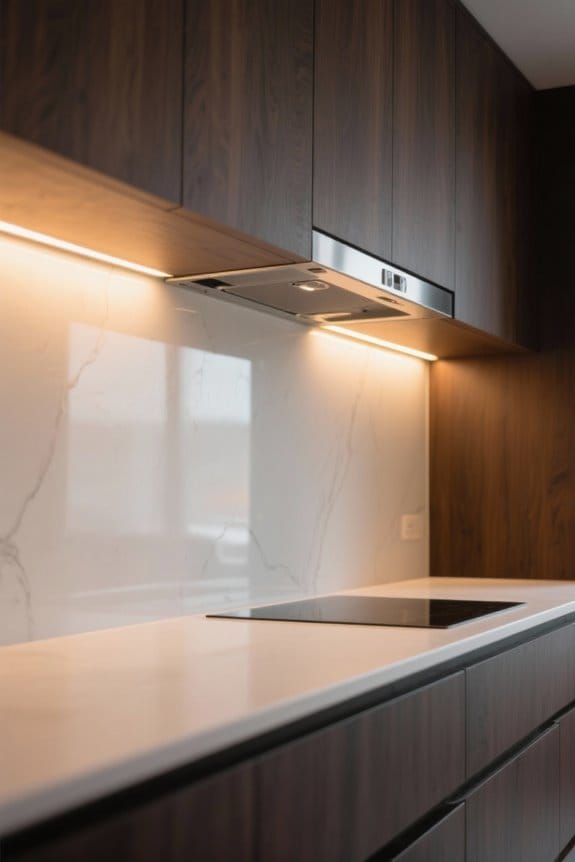
When designing a kitchen, selecting the appropriate artificial lighting is vital, as it greatly impacts how materials and finishes are perceived. Artificial lighting types vary, including incandescent bulbs, fluorescent fixtures, and LED lights, each offering distinct color temperatures. Incandescent bulbs emit warm light (2700K-3000K), enhancing warm hues in cabinetry, while cooler fluorescent lighting can distort warm tones, leading to an unflattering effect on surfaces. LED lights provide versatility with color temperatures ranging from warm (2700K) to cool (5000K and above), effectively highlighting various kitchen materials. Consideration of lighting options is essential for achieving ideal color accuracy and task visibility. Thoughtful selection of artificial lighting notably enhances the overall aesthetic and functionality of the kitchen environment. For optimal color representation in kitchen spaces, selecting lighting with CRI 90 or above ensures that food, countertops, and cabinetry display their true colors accurately.
Recommended Products

✅LED FRONTLIT MIRROR: The Lighted Vanity mirror features LED light that creates bright yet energy-efficient illumination. Our long-lasting LED provides 50,000 hours of use.

Contemporary Design features a linear chandelier with staggered edge-lit LED panels and a matte black metal finish for a modern look.

ETESIAN CHANDELIER FAN D'LIER DIMENSIONS: 21.9" High x 35.25" Wide; Rod-Hung Adjustable Height: Up to 39.90"; Ceiling Canopy: 7.25" x 2.13"; Weight: 38.5 lbs.
The Significance of Light Placement on Color Perception
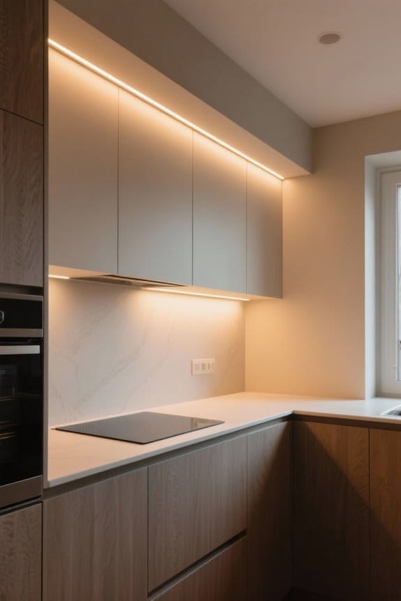
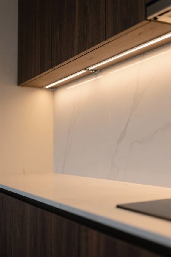
The placement of light sources within a kitchen plays an essential role in shaping color perception and overall aesthetics. Proper light placement can dramatically influence how kitchen materials appear. For example, direct overhead lighting often creates harsh shadows that alter the visual appeal of cabinet finishes. Utilizing under-cabinet task lighting effectively highlights colors and textures, ensuring a more accurate representation. Accent lighting, strategically positioned, emphasizes specific features, creating dynamic shadows and highlights that enhance color depth. Combining ambient light with task and accent lighting allows for balanced illumination, improving color perception across various materials. Remember to reflect on the angle of light with surfaces; angled lighting can amplify textures, transforming the kitchen’s overall atmosphere and visual appeal. Selecting lights with a high CRI rating above 80 ensures the most accurate representation of material colors and finishes.
Recommended Products

1.ENERGY SAVING - Our products have high efficiency of 110+lumens per watt, these high efficient output can save 80% on electricity bill of lighting comparing with traditional fluorescent light bulb.

Experience guilt-free energy efficiency with these led cabinet lights, offering wide area light distribution to elevate the ambiance of closet spaces, cabinets, counters, shelves, bookcases, and displays.
12V Hardwire LED kit - 4000K Pure White Color
How Different Cabinet Colors Respond to Various Lighting
How do different cabinet colors respond to various lighting conditions? The type of light greatly influences the perception of cabinet colors. Warm light, ranging from 2700K to 3000K, enhances hues like yellows and browns, enriching their appearance in a kitchen environment. Conversely, cooler tones, typically above 5000K, may mute these warmer colors. Natural lighting presents another variable; white cabinets may appear crisp during the day but take on a warmer tone in the evening. Under artificial lighting, like incandescent sources, shades of gray and blue can lose vibrancy. LED lighting allows for color temperature adjustments, emphasizing different cabinet finishes. Testing samples under various lighting conditions will guarantee ideal color harmony and overall aesthetic appeal. Modern edge-lit LED fixtures offer exceptional brightness up to 5000 lumens while providing customizable color temperatures for optimal cabinet appearance.
Recommended Products

Sonneman Stix Contemporary Chandelier: Elevate your decor with the Sonneman Modern Lighting Stix 6-Arm LED Hanging Chandelier, featuring a contemporary design that adds a touch of sophistication to your kitchen island, dining room, or living room.

Longree chandelier using 100% hand blown murano glass in a beautiful colour with light transmission anti-scratch and heat dissipation, long lifetime. giving you crystal clear and fresh art feel.

【Superior Illumination & Energy Savings】 Long-life LEDs with high-efficiency drivers deliver superior illumination with a high efficacy of 150 lm/w, reaching 7500 lumens and lasting over 50,000 hours. No bulb replacement is required. Plus, it can save up to 85% of electricity.
Practical Tips for Selecting Cabinet Colors Based on Lighting Conditions
Selecting cabinet colors based on lighting conditions requires a systematic approach to guarantee the desired aesthetic is achieved. Begin by testing color samples under both natural and artificial lighting. Note that warm light (2700K-3000K) enhances warmer cabinet colors, while cooler light (4500K+) may mute them, impacting your choices. Assess your kitchen orientation; north-facing rooms often have cooler light, while south-facing areas benefit from warmer illumination. Pay attention to the sheen level of finishes—satin finishes reflect light, enhancing vibrant colors, while matte finishes absorb, softening appearances. To maximize natural light, consider incorporating mirrors and minimizing window treatments. Consider installing LED dimmer switches to adjust lighting levels throughout the day for optimal color rendering and ambiance. These strategies will help ensure that selected cabinet colors remain bright and welcoming, even in challenging lighting conditions.
Recommended Products

EASY TO INSTALL AND MAINTAIN - Simply secure the vent hood base in place, install the kitchen vent, and attach the top to complete your custom Primed hood vent and start cooking in style

【Premium Vanity Construction】 The Stafford 72-inch bathroom vanity crafted from premium solid hardwood and plywood for superior strength and durability. Ariel Midnight Blue 72" bathroom vanity with sink provides a longer lifespan than MDF or particle board cabinets and resists moisture, warping, cracking, and paint peeling. A Sherwin-Williams PU coating delivers a durable finish that withstands daily wear and tear. Hidden leveling feet deliver a stable, wobble-free fit on uneven floors.

【Premium Vanity Construction】 The Stafford 84-inch bathroom vanity crafted from premium solid hardwood and plywood for superior strength and durability. Ariel Espresso 84" bathroom vanity with sink provides a longer lifespan than MDF or particle board cabinets and resists moisture, warping, cracking, and paint peeling. A Sherwin-Williams PU coating delivers a durable finish that withstands daily wear and tear. Hidden leveling feet deliver a stable, wobble-free fit on uneven floors.
Frequently Asked Questions
What Color of Light Is Best for a Kitchen?
The best color of light for a kitchen combines neutral white (3500K-4000K) for general illumination and task lighting. Consider fixture placement, room size, and reflective surfaces to enhance ambiance and support the chosen design style and paint selection.
How Does Lighting Conditions Affect Different Surfaces?
Lighting conditions greatly influence surface reflections, texture perception, and brightness impact. Variations in light diffusion create warmth illusions, while shadows enhance material contrast. Gloss effects boost color saturation, thereby enriching ambiance creation throughout the space.
How Does Changing the Light Source Change the Appearance of Color?
Changing the light source dramatically influences color perception, revealing hidden complexities in paint finishes. Lighting angles, combined with LED brightness and color temperature, can shift warm tones to cool tones, impacting the harmony of reflective surfaces under natural light.
Is 3000K Too Yellow for a Kitchen?
3000K is not too yellow for a kitchen; it can enhance warmth, influencing color perception and mood setting. However, design choices regarding light balance and material compatibility are essential for ideal reflection quality and visual comfort.